Data Visualisation
The Data Visualisation page allows you to explore and analyse your data using a variety of visual tools. This helps in understanding data distributions, correlations, and feature interactions.
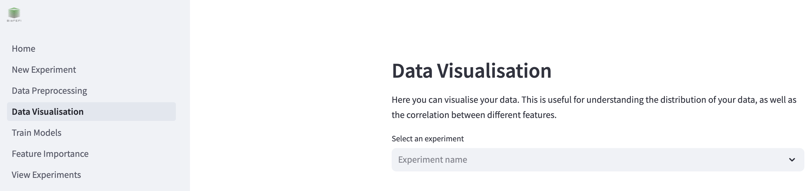
To begin, select your experiment from the dropdown menu where it says “Select an experiment”. This will load the dataset associated with your selected experiment.
Visualisation Options
The page provides the following visualisation tools:
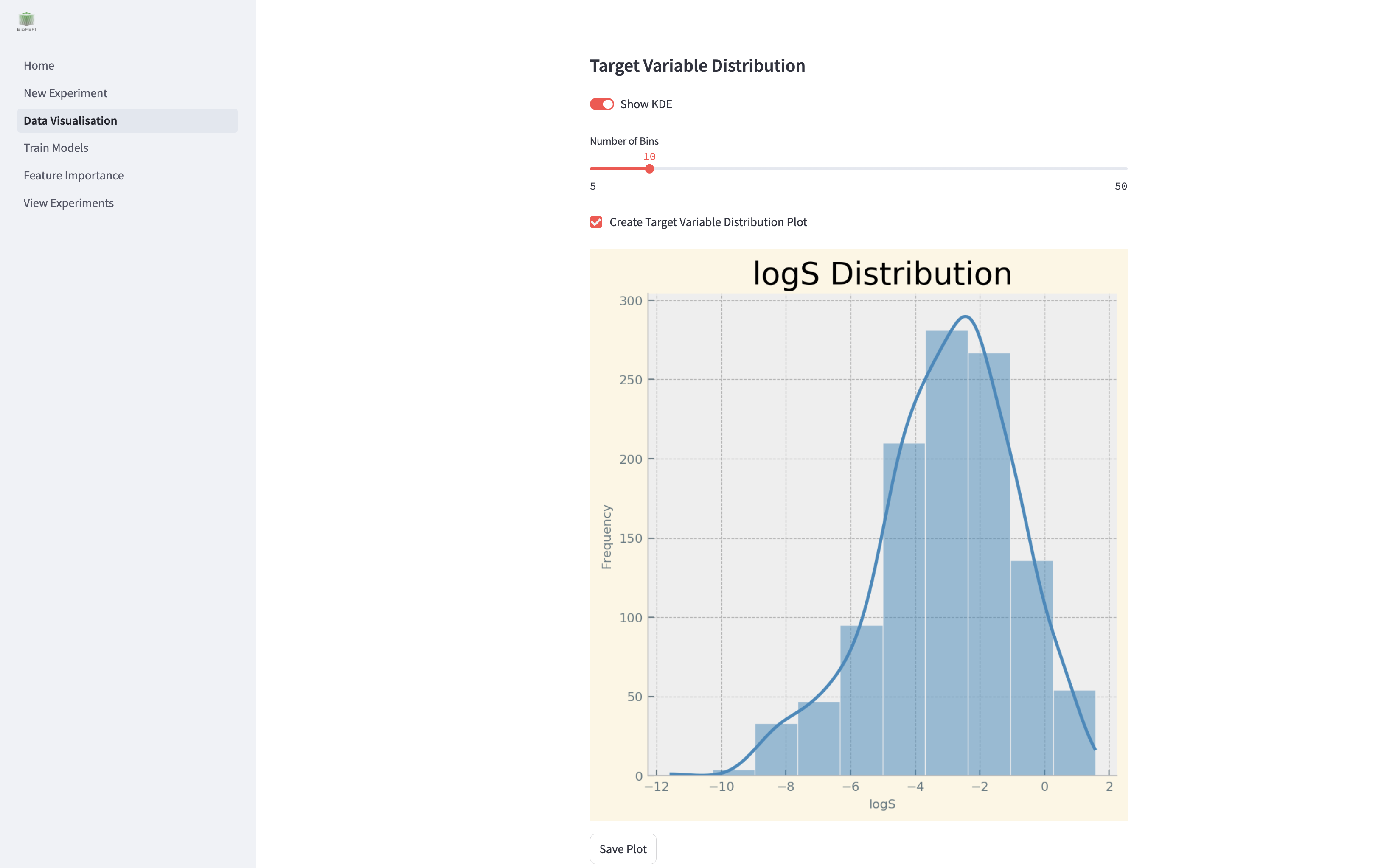
Target Variable Distribution
Visualise the distribution of your target variable using histograms and KDE (Kernel Density Estimation).
Show KDE: Toggle to include a KDE curve.
Number of Bins: Adjust the number of bins in the histogram.
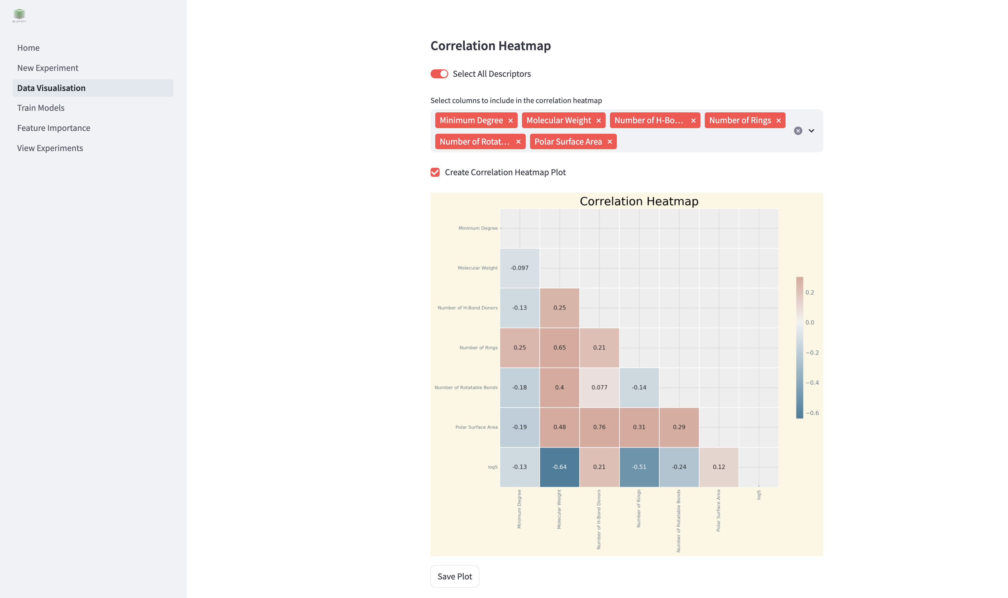
Correlation Heatmap
Display a heatmap showing correlations between selected features.
Select All Descriptors: Include all features in the heatmap.
Select Columns: Manually select specific features for the heatmap.
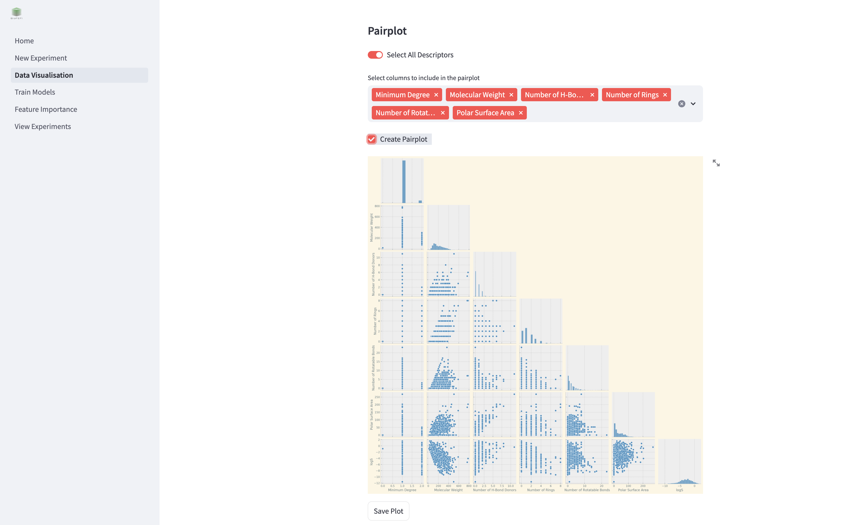
Pairplot
Generate pairwise scatter plots for selected features to identify trends and interactions.
Select All Descriptors: Include all features in the pairplot.
Select Columns: Manually select specific features for pairplot generation.
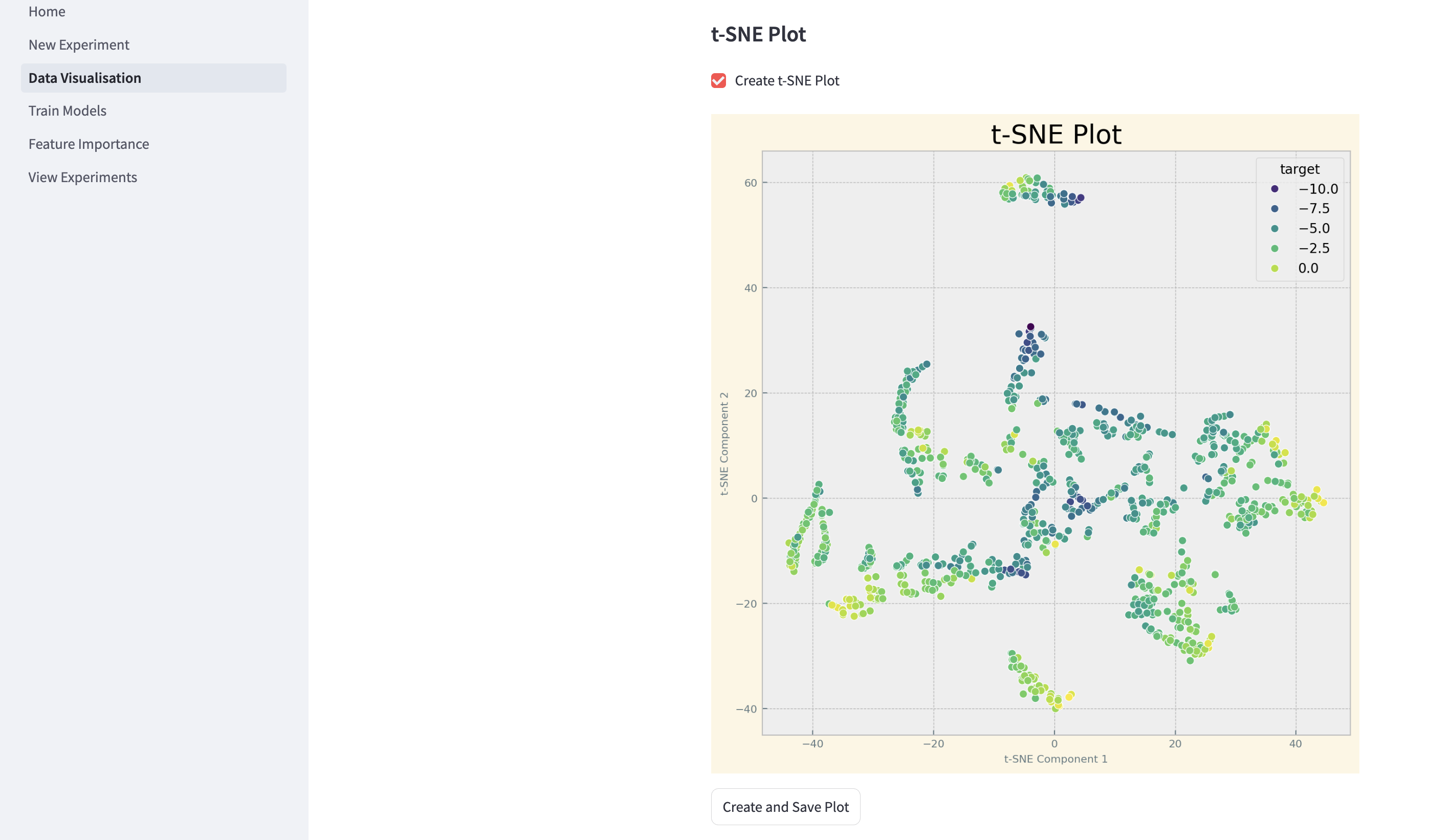
t-SNE Plot
Visualise high-dimensional data in two dimensions using t-SNE.
Saving Visualisations
You can save generated plots to disk for reporting or further analysis. The save options are located below each plot tool.
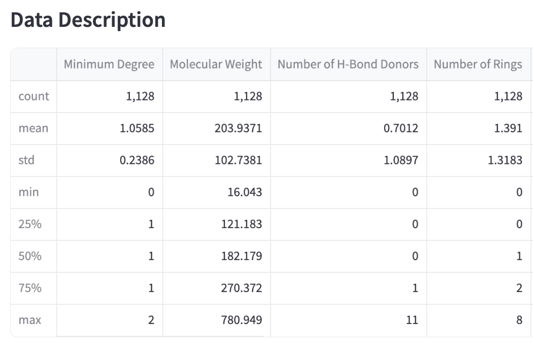
Data Description
Below the visualisation tools, the page displays:
The loaded dataset.
A summary of the dataset, including mean, standard deviation, and other statistics.
How to Start
Select an experiment.
Choose the visualisation type.
Adjust parameters as needed.
Click the buttons to generate and save visualisations.
Press “Create and Save” to save plots for further use.